Home Detail Page: Simplifying home discovery
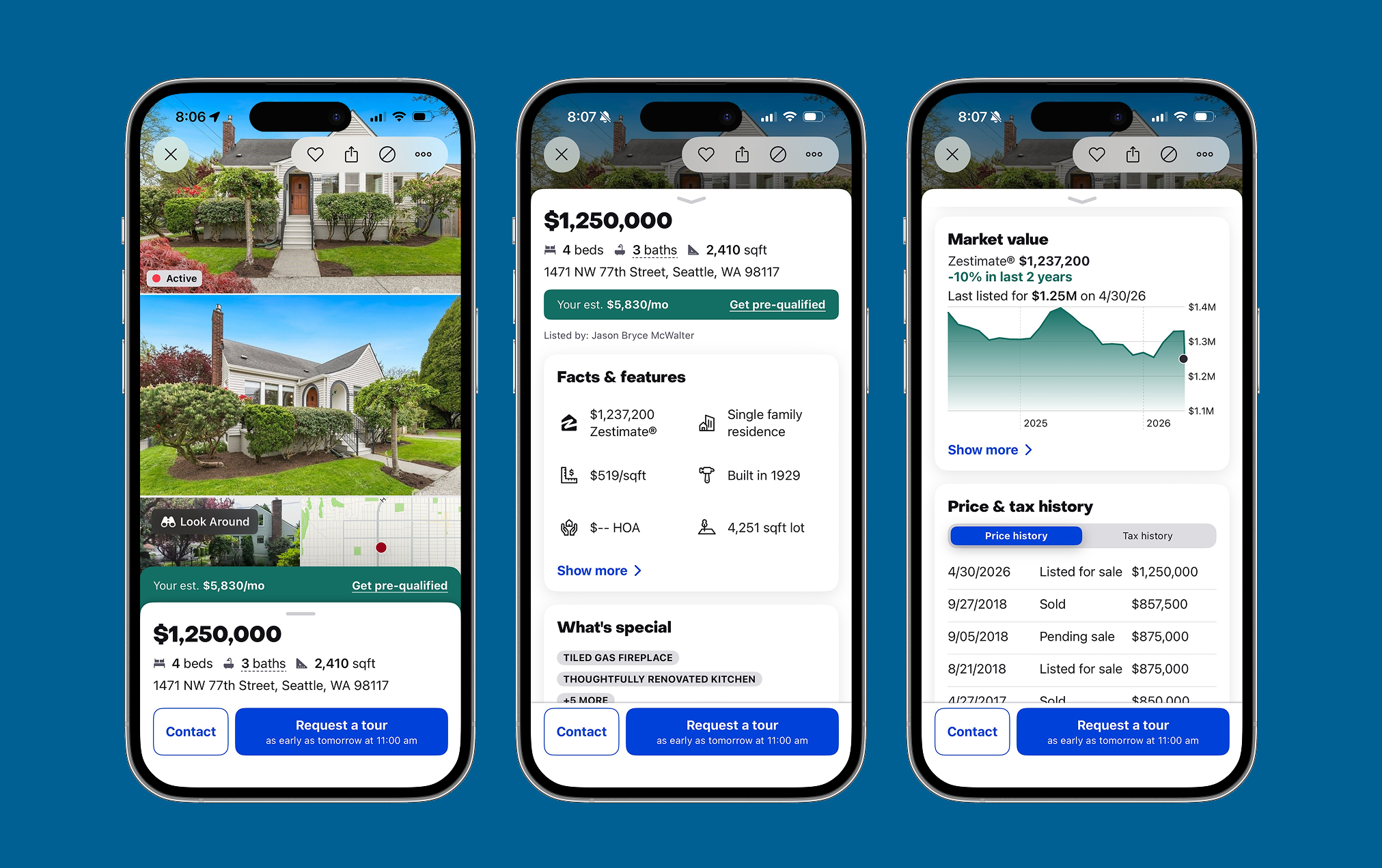
The Zillow Home Detail Page (HDP) is the company's most important product surface, influencing approximately 85% of Zillow's annual revenue, or about $1.7 billion. This redesign transformed an overloaded, single-page experience into a streamlined Hub & Spoke framework that improved usability while creating a scalable foundation for future product growth.
Project overview
Role
Lead Product Designer
Timeline
2022–2023
Platforms
iOS, Android
Teams
Product Management, Engineering, User Research, Content Design, Data Science, Product Marketing
My role
Led the end-to-end redesign of the Home Detail Page, defining the Hub & Spoke strategy and experience model.
Aligned cross-functional teams around a scalable design framework and future product vision.
Established the interaction patterns, visual direction, and accessibility strategy while balancing customer and business goals.
Outcomes
Increased full Home Detail Page scroll-through from 12% to 33%.
Generated approximately $4M in additional annual Zillow Home Loans revenue on iOS.
Improved users' perception of the product's modernity.
Fixed accessibility issues affecting approximately 30% of users with larger text settings.
Created a scalable framework that enabled future experiences such as Climate and Schools.
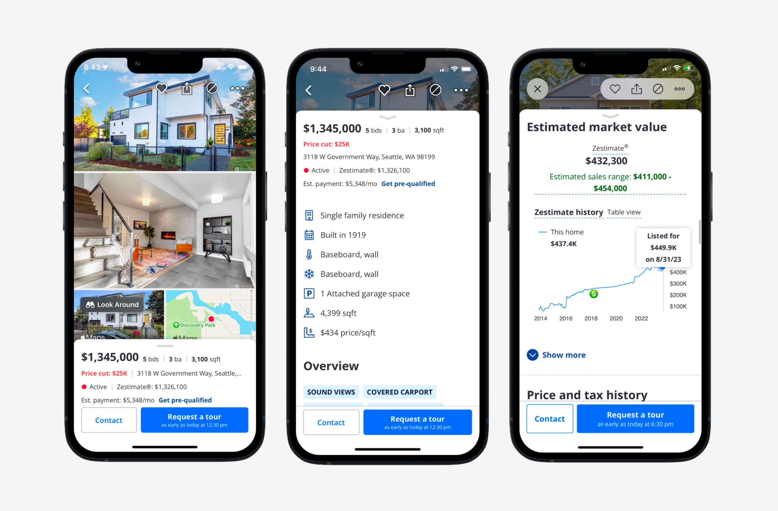
Previous design
The challenge: "built by committee"
Years of incremental feature additions had turned the Home Detail Page into the longest property detail experience in the industry. As more teams optimized for their own goals, the overall experience became increasingly difficult for customers to navigate.
Information overload: Critical details were buried in a long, continuous scroll, forcing buyers to hunt for what mattered most.
Poor organization: Related information was scattered across the page, making it difficult to scan and understand.
Interaction friction: Unclear labels, competing calls to action, and inconsistent patterns reduced engagement and made key features harder to discover.
“The page just scrolls on and on and on... and I can never find what I am looking for”
The solution: hub & spoke system
The redesign helped users quickly assess a home while making it easy to explore the details that mattered most.
Hubs: Concise summaries that organized key information into clear, scannable sections.
Spokes: Dedicated destination pages for deeper exploration of topics such as Schools, Climate, and the Neighborhood.
Visual language: A simplified, modern interface with stronger hierarchy, clearer navigation, and richer data visualizations
Previous design
The previous Home Detail Page was easy to scroll but difficult to navigate. Its long, continuous structure made wayfinding challenging, causing users to lose track of key information, become frustrated, and ultimately give up.

New design
By shifting to a Hub and Spoke model, the most important information could be surfaced on the hub while giving users the option to explore dedicated spokes for deeper context only when needed.

Result & impact
The Hub and Spoke redesign delivered measurable improvements across engagement, business impact, accessibility, and long-term product scalability.
Increased engagement: Full Home Detail Page scroll-through rate increased from 12% to 33%.
Business impact: Generated approximately $4M in additional annual Zillow Home Loans revenue on iOS.
Improved perception: Users rated the redesigned experience as more modern.
Greater accessibility: Resolved text truncation issues for the approximately 30% of users with larger accessibility text sizes enabled.
Future-ready architecture: Created a scalable foundation that enabled teams to introduce complex content, including Climate and Schools, without increasing cognitive load or overwhelming the page.